9.8 KiB
9.8 KiB
🔘按钮类组件
1.RibbonButton
1.1 概述
- 父类:Button
- 展示:

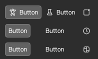
RibbonButton Light/Dark Style
1.2 属性
| 名称 | 说明 | 示例图片 |
|---|---|---|
isDarkMode |
bool, 夜间模式,默认由RibbonTheme的同名属性控制 |
\ |
showBg |
bool, 显示按钮背景,默认为True |
 |
showHoveredBg |
bool, 显示鼠标覆盖背景,默认为True |
  |
adaptHeight |
bool, 自适应按键高度至父容器高度,默认为False |
 |
showTooltip |
bool, 显示按钮提示浮窗,默认为True |
 |
iconSource |
var, 按钮图标,支持输入图片链接(qrc://或file://)或者使用内嵌微软图标(RibbonIcons) |
 |
iconSourceFilled |
var,由于微软图标空心版和实心版对应的代码并不完全一致,当使用内嵌微软图标且仅使用iconSource时实心图标出现异常,请将RibbonIcons替换为RibbonIcons_Filled并为此属性赋值,如RibbonIcons.Home -> RibbonIcons_Filled.Home |
\ |
imageIcon |
alias, 供直接访问按钮的图片图标对象 |
\ |
ribbonIcon |
alias,供直接访问按钮的内嵌图标对象 |
\ |
bgColor |
string,定义按钮的背景颜色,默认会随着亮/暗色主题切换 |
\ |
hoverColor |
string,定义鼠标放在按钮上的颜色,默认会随着亮/暗色主题和是否显示按钮背景切换 |
\ |
pressedColor |
string,定义按钮按下的颜色,默认会随着亮/暗色主题和是否显示按钮背景切换 |
\ |
checkedColor |
string,定义按钮被选中时的颜色,默认与pressedColor一致 |
\ |
textColor |
string,定义按钮文字的颜色,默认亮色主题为黑,暗色主题为白 |
\ |
textColorReverse |
bool,文字颜色凸显,默认为True, 在按钮无背景时,按钮若被鼠标覆盖/按下/选中,按钮文字颜色会变淡以凸显(仅当使用深色时才明显,此属性有被取消的可能) |
\ |
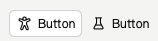
1.3 示例代码
1.3.1 普通按钮
1.3.1.1 代码
RibbonButton{
    text:"Button"
}

RibbonButton{
    text:"Button"
    showTooltip: false //不显示按钮提示浮窗
}
1.3.1.2 代码预览

Basic button
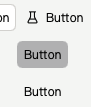
1.3.2 带图标的普通按钮
1.3.2.1 代码
RibbonButton{
    text:"Button"
    iconSource: RibbonIcons.Accessibility
}

RibbonButton{
    text:"Button"
    showBg:false // 不显示背景
    iconSource: RibbonIcons.Beaker
    checkable: true // 可被选中
}
1.3.2.2 代码预览
Basic button with icon
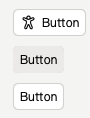
1.3.3 图标按钮
1.3.3.1 代码
RibbonButton{
    showBg:false // 不显示背景
    iconSource: RibbonIcons.Badge
    iconSourceFilled: RibbonIcons_Filled.Badge // 定义实心图标
    checkable: true // 可被选中
    tipText: "Button" // 提示信息文本
}
RibbonButton{
    showBg:false
    iconSource: RibbonIcons.Clock
    iconSourceFilled: RibbonIcons_Filled.Clock
    tipText: "Button"
}
RibbonButton{
    showBg:false
    iconSource: RibbonIcons.Board
    iconSourceFilled: RibbonIcons_Filled.Board
    checkable: true
    tipText: "Button"
    showTooltip: false // 不显示提示信息
}
1.3.3.2 代码预览
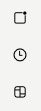
Icon button
2.RibbonSwitchButton
2.1 概述
- 父类:Button
- 展示:


RibbonSwitchButton Light/Dark Style
2.2 属性
| 名称 | 说明 | 示例图片 |
|---|---|---|
isDarkMode |
bool, 夜间模式,默认由RibbonTheme的同名属性控制 |
\ |
showGrabberText |
bool,显示抓握指示器的文本,默认文本为Open/Close |
 |
grabberText |
string,默认为开关被选中(checked)时为Open,否则为Close |
\ |
textColor |
string,开关的标签文本颜色,默认夜间模式为white,反之为black |
 |
textSize |
int,开关的标签文本大小 |
\ |
grabberCheckedColor |
string,开关被选中情况下抓握指示器的背景颜色,默认夜间模式下为#8AAAEB,反之为#2850A4 |
 |
grabberUncheckedColor |
string,开关未被选中情况下抓握指示器的背景颜色,默认夜间模式下为#292929,反之为white |
 |
grabberTextCheckedColor |
string,开关被选中情况下抓握指示器的文本颜色,默认夜间模式下为black,反之为white |
 |
grabberTextUncheckedColor |
string,开关未被选中情况下抓握指示器的文本颜色,默认夜间模式下为white,反之为black |
 |
grabberColor |
string,抓握指示器颜色 |
 |
borderColor |
string,开关的边框颜色,默认夜间模式下为white,反之为#616161 |
 |
borderWidth |
real,开关的边框宽度,默认为1.4 |
|
textBold |
bool,开关标签文本粗体显示,默认为false |
\ |
textOnLeft |
bool,开关标签文本显示在开关左边,默认为false |
 |
showTooltip |
bool, 显示按钮提示浮窗,默认为False |
\ |
tipText |
string, 按钮提示文本 |
\ |
2.3 示例代码
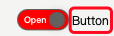
2.3.1 显示抓握指示器文本的开关
2.3.1.1 代码
RibbonSwitchButton{
    text: "Button"
    showGrabberText: true // 显示抓握指示器的文本
    textOnLeft: false // 让开关标签显示在开关左边
    grabberCheckedColor: "indigo" // 抓握指示器颜色
}
2.3.1.2 代码预览

RibbonSwitchButton With Grabber Text
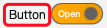
2.3.2 不显示抓握指示器文本的开关
2.3.2.1 代码
RibbonSwitchButton{
    text: "Button"
    showGrabberText: false // 显示抓握指示器的文本
    textOnLeft: false // 让开关标签显示在开关左边
    grabberCheckedColor: "indigo" // 抓握指示器颜色
}
2.3.2.2 代码预览

RibbonSwitchButton Without Grabber Text